
The aim of this project was to revamp the PayCentre agent portal. PayCentre is an innovative agent banking solution targeted at driving financial inclusion in underbanked and financially under-served locations across Nigeria. The company was experiencing tremendous growth in agent enrollment and active agent transactions; thus there was a need to improve the usability and visual appeal of the agent portal. Agents often complained about waiting too long for the dashboard to load; difficulty in navigating and finding relevant information. Also, the visual language was outdated and did not align with the current branding of the company. However, due to engineering and time constraints, the current redesign was made just for mobile viewports.
The PayCentre agent portal was largely unresponsive and had an outdated user interface. High-level goals were:
PayCentre boast of an agent network of 10,000 plus. A vast majority of these users access the web portal on mobile devices.
In-house.
UX Designer, User Interface Designer, Interaction Designer.
1- Month of Design and Implementation.
The fin-tech space was new to me, I got rapidly on-boarded into the product space by the product managers and developers. The goals were clearly slated with feedback obtained from users, the road map was defined and I was tasked with providing deliverables to the aforementioned goals. In the early stages of the project, we held team meetings to review the features of the portal. We removed features such as graphs and charts which were hogging browser memory. The loan feature was also removed from the portal because it was temporarily inactive and the report page was taken down from the website because it was not functional. Based off of user feedback, the key code generator was removed from its parent branch and made into an actionable modal.
The key code generator was the most frequent page for first-time users because a key code is needed to activate the users Mobile Point of Sales Device. Moving the key code up a folder made it easier to discover and access.
The PayCentre logo had been recently redesigned, however, due to some miss interpretations of would-be agents, I was tasked with adjusting the redesigned logo/symbol with creative direction from the product owner. The PayCentre logo is an interesting one, it is a fusion of money in the form of cash and a location pin. The combination of these two elements represents the promise of PayCentre providing elite financial services where ever their customers are.
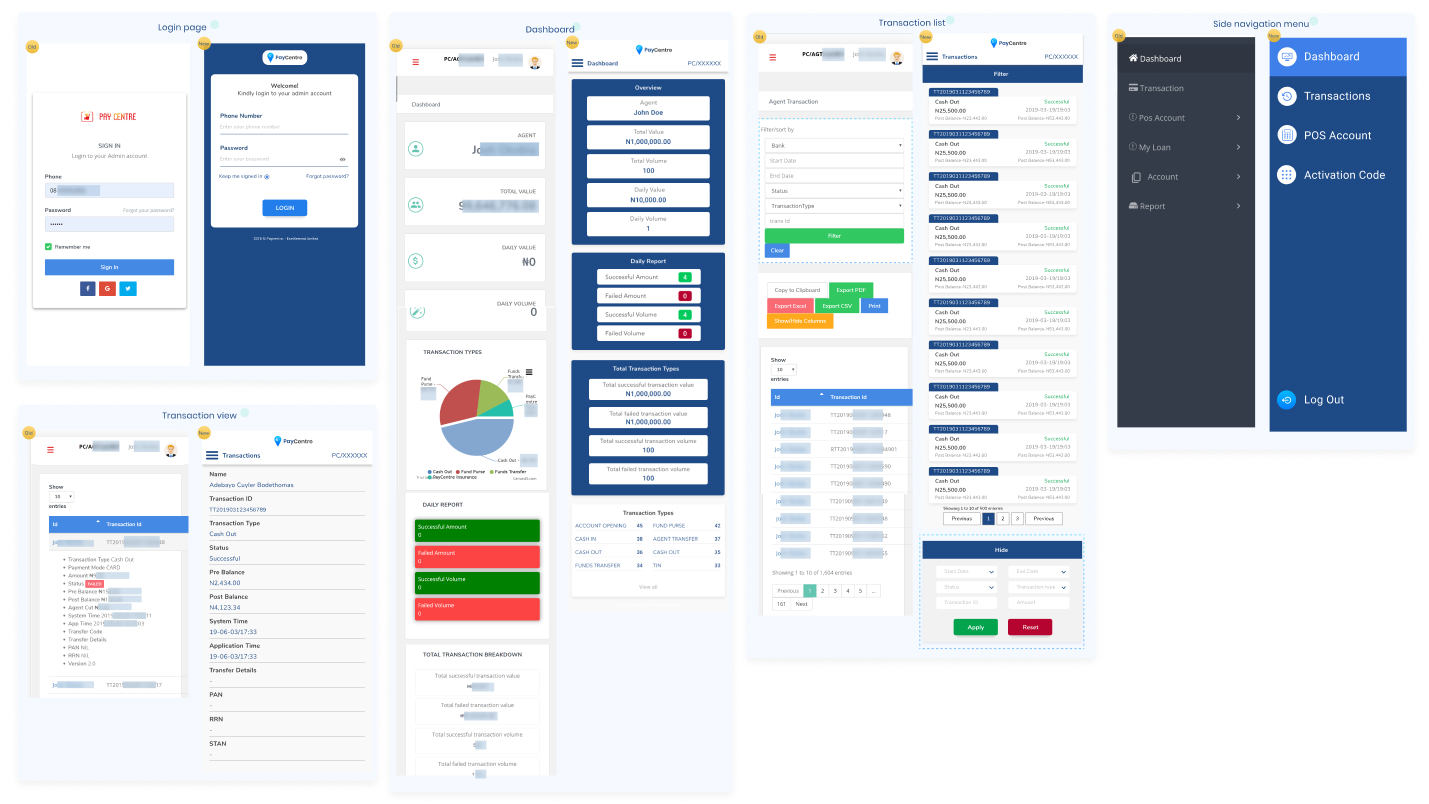
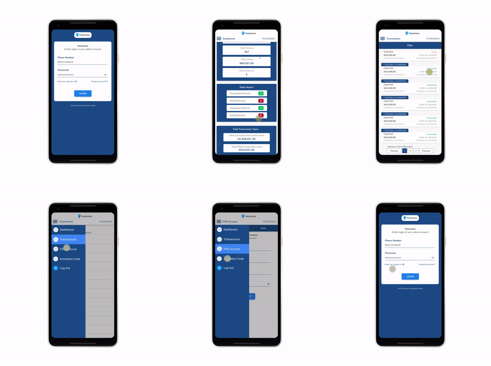
To kick off the redesign of the user interface, I defined a minimalist theme that would evoke a strong feeling of security and assurance to users of the portal. The user interface was designed in components in order to create a seamless developer handoff. For the login page, the colours were overhauled to align with the current brand identity. The input field was also redesigned to allow for a minimal look and feel. Using colours and type scaling, the user’s attention is easily kept in focus on the current task.
As per the design goals, the colours of the dashboard were overhauled. The header was modified to present a cleaner appearance, the avatar was taken out to make space for the agent ID. The menu icon and the page title were moved to the same horizontal axis. The header was going to be persistent across all pages and thus it had to be inherently adaptive to the central alignment of subsequent pages. The main elements of the page were aligned to the central axis to provide a more convenient layout for users to consume information from the dashboard.
The side navigation initially featured a black background with navigation links been paired with symbols which did not necessarily convey the function of the pages. The redesign saw the use of accurate symbols depicting the function of the navigation links/pages. The symbols form were outlines wrapped in a white background to provide contrast while maintaining the visual feel of the branding.
The transaction list page saw a change in its layout, the filter section was transformed into a modal, with its call to action been located at the top of the transaction list page. The reason for this was that the filter section as it was consumed about 60% of the initial viewport. The data options on the former page i.e Export PDF were taken out due to their lack of functionality. The form of the former transaction item was a container with two fore labels; the agent name and the transaction ID. A drop-down on tap would reveal transaction details. This design was poorly adapted for mobile devices. For the redesign, I went with a compact form to display the necessary details a user would want to go through. The form was inspired by the pseudo-skeuomorphic file-folder visual cue. The layout of the redesigned transaction item provides a not only responsive view but also encourages positive scannability for users across the main and cross axis.
On the former portal, clicking the transaction item will reveal a dropdown of the additional transaction details, although it was an efficient way of going back and forth between transactions, it was clustered and did not allow for users to clearly read the text. The redesigned version was made into a page of its own. In the redesigned version, items are placed evenly across the page from top to bottom. The type scaling and dividers make it easier for users to clearly consuming information about the transaction.
The redesigned agent portal for mobile viewports was a success in the end. The load time of the dashborad significanty improved due to the fact that the charts were disabled for the mobile devices. The user interface of the portal became clean and much more usable. The portal went from supporting a user base of about 3,000 agents at the start of the project, to 10,000 plus agents. Effective and consistent collaboration with the product team and developers ensured that all the set goals for the project were met with minimal delays from software testing to user testing and then to going live.

Usability testing was largely informal due to time and engineering constraints. Fortunately, user testing revealed little to be changed about the project design-wise, except for little engineering bugs. The initial colour of the dashboard background (PayCentre Deep Blue) and its child containers (PayCentre Light Blue) were disliked by users because it came out to strong. Upon iteration, the background colour of the dashboard was changed to White and the background colour of its child containers was changed to the PayCentre Deep Blue.